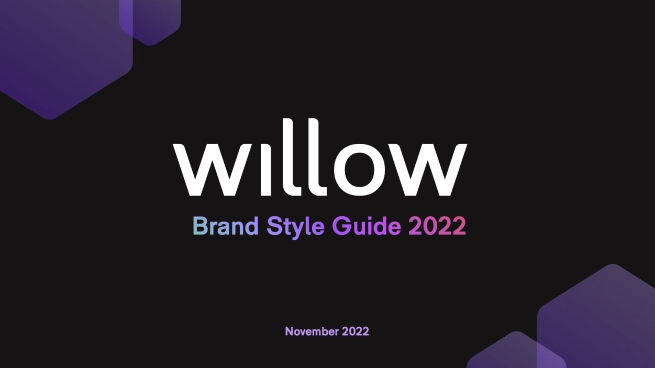
The brand
in the built
REBRANDING
& ENHANCEMENT
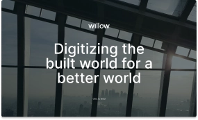
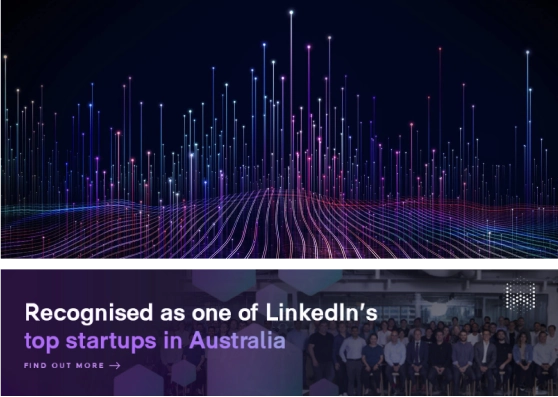
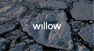
Willow is a global tech company that revolutionizes building and infrastructure management by integrating data and skills for enhanced security, sustainability, and efficiency.
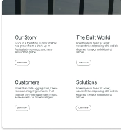
Our long-standing collaboration with Willow encompasses rebranding, brand content creation, and website and brand interactive landings design and development.
Explore how we rebuilt this brand, from core elements to compelling content that embodies its true value.
2023/2024
[comprehend]
/
/
[generate insights]
[built]
/
Step by step
[Our creative process]
Initial brand
stage.


Concept.
Visual
Direction.

Brand
Elements.


Brand content
& interaction.
00
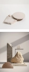
INITIAL BRANDS STAGE
Starting
point.


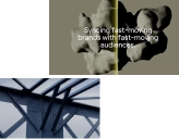
01
CONCEPT
KEYWORDS
CONCEPT
Knowthe
parts,
masterthe
whole.
02
VISUAL DIRECTION
[mind mapping]
[nature]
[from primary resources]
[optimization]
[to Infrastructures ]


04
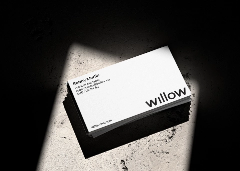
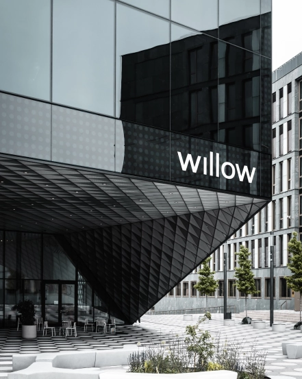
BRAND ELEMENTS
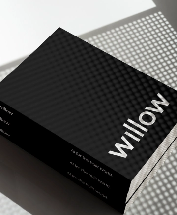
LOGO
The original design was visually complex and challenging in certain applications. We refined the logo to enhance its effectiveness, accessibility, and recognition.

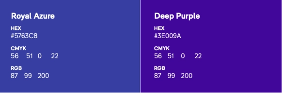
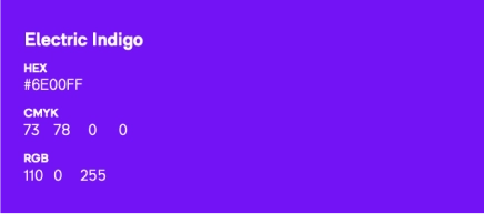
COLOR PALETTE
streamlined
accessible
bold & clear
bold black
#000000
PURE white
#FFFFFF
light gray
#EAEAEB
SMART YELLOW
#DCFF01
willow blue
#5360FF
TYPOGRAPHY
03
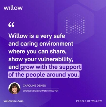
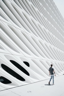
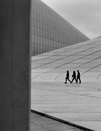
IMAGERY CURATION
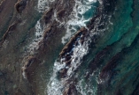


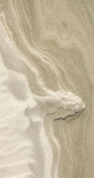
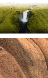

HUMAN
02

UNIQUE
INTERESTING

03
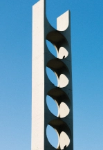
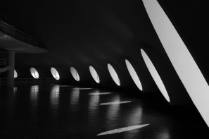
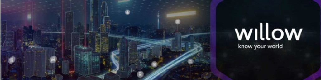
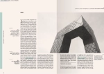
ARCHITECTURE
INNOVATION

04
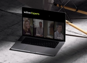
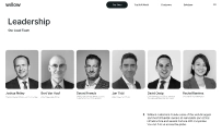
BRAND CONTENT
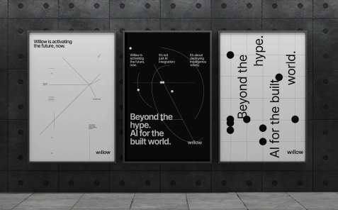

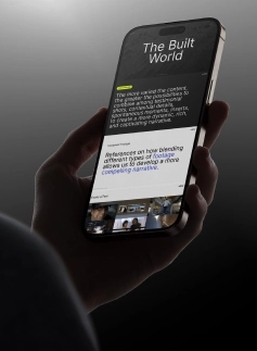
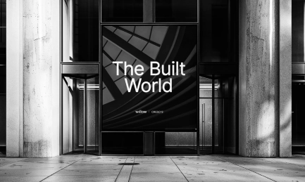
05
BRAND INTERACTIONS
data
display


VIDEO TREATMENT
streamlined
accessible
bold & clear
INTERACTION
UX-UI
design
development

WEBSITE +
THEMED LANDINGS
2
INTERACTIVE
LANDINGS
7+
SECTIONS
12
VIDEOS